
Image Relay
Role: Principal Designer
Project: At Image Relay, a DAM and PIM software company, I was hired to build a new design system after a brand refresh and lead a full redesign of the platform. The goal was to modernize the experience and make it easier for marketing and e-commerce teams to manage and share digital assets and product data.
Over three years, I collaborated closely with the engineering team to create a more intuitive, consistent, and visually engaging interface. The transformation not only elevated the product and brand experience but also helped position the company for its acquisition in 2024.
Where Brand Meets
Product: The Design System
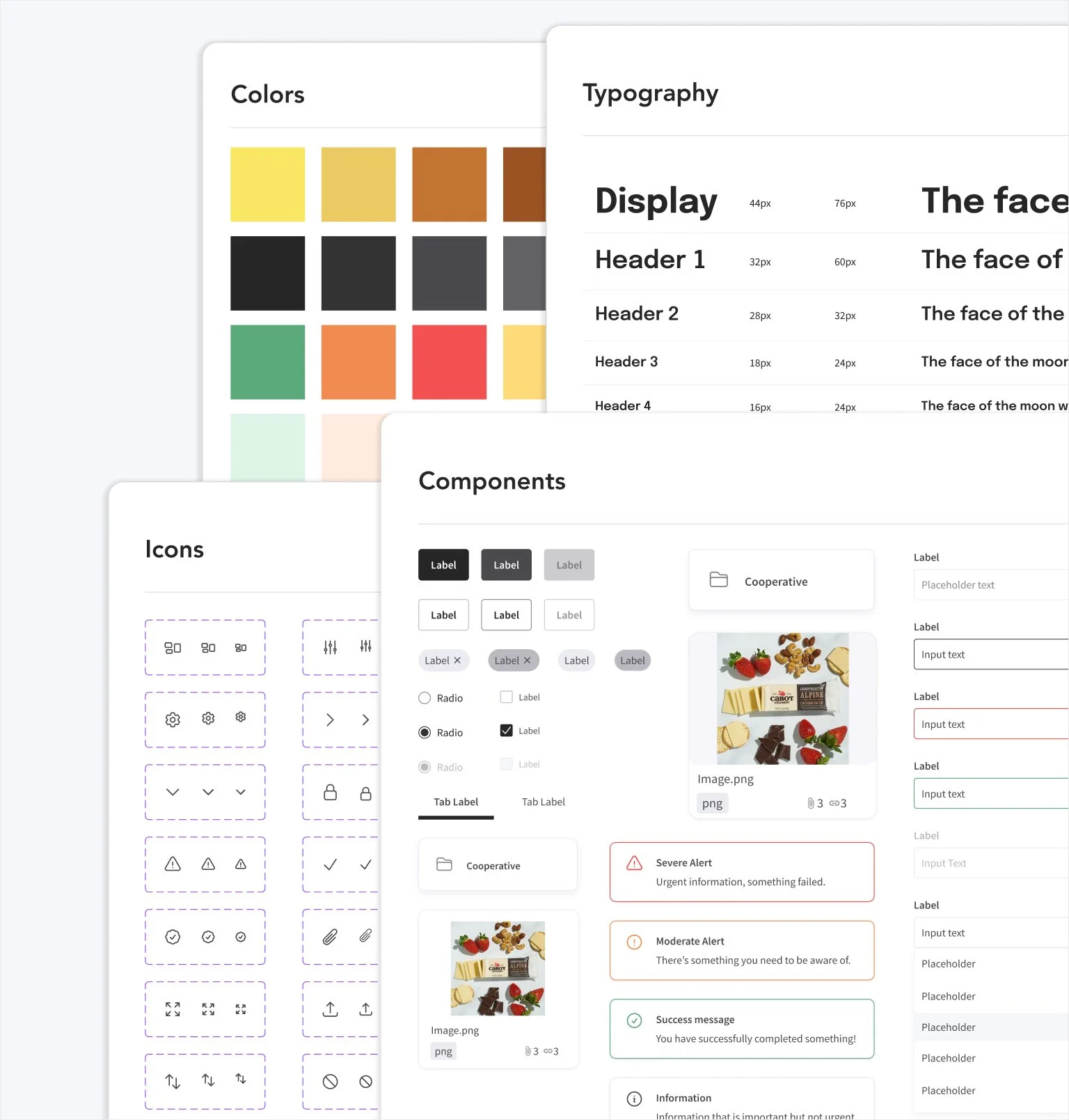
Designing a scalable design system is about creating a foundation that can grow alongside the product. I focused on building flexible, reusable components and clear guidelines that ensured consistency while leaving room for innovation.
By aligning typography, color, spacing, and interaction patterns, the new system empowered my team to design and develop efficiently without sacrificing creativity.
Simplifying Interactions, Enhancing Experience
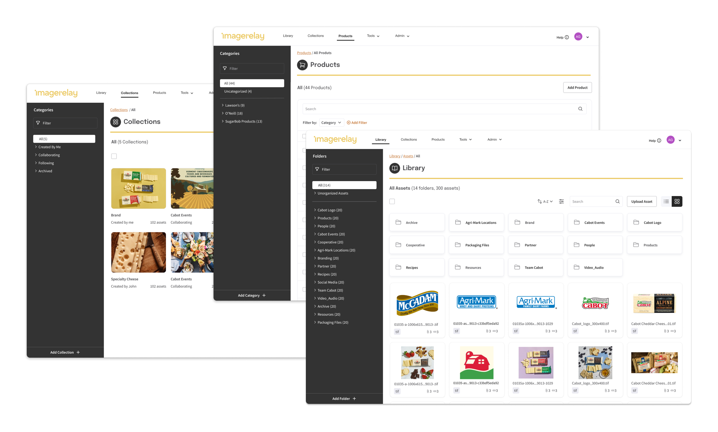
I redesigned the experience with a focus on clarity and ease of navigation. Each page was given distinct way-finding elements to help users immediately understand where they were and how to move between sections. These improvements not only made the app easier to use but also created a more consistent and engaging experience that supports users in achieving their goals with confidence.
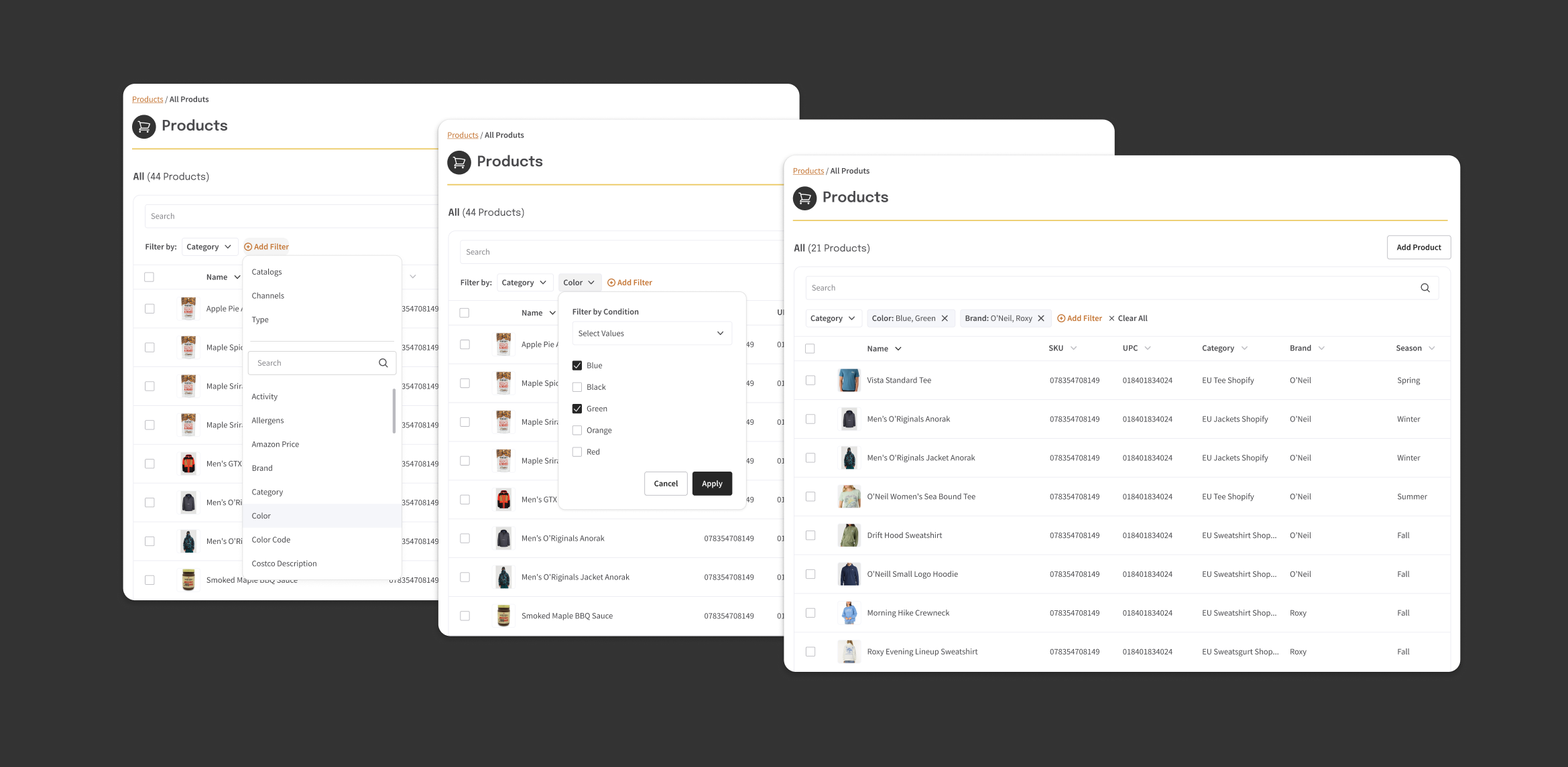
Enhancing Product Search
Search and filtering products was a major pain point for our users. As part of the redesign I created a dynamic dropdown menu that filters products by tags, allowing users to add, alter, or remove filter tags in real time. This solution minimized friction and made culling products more efficient, supporting both complex multi-filter queries and quick removals.
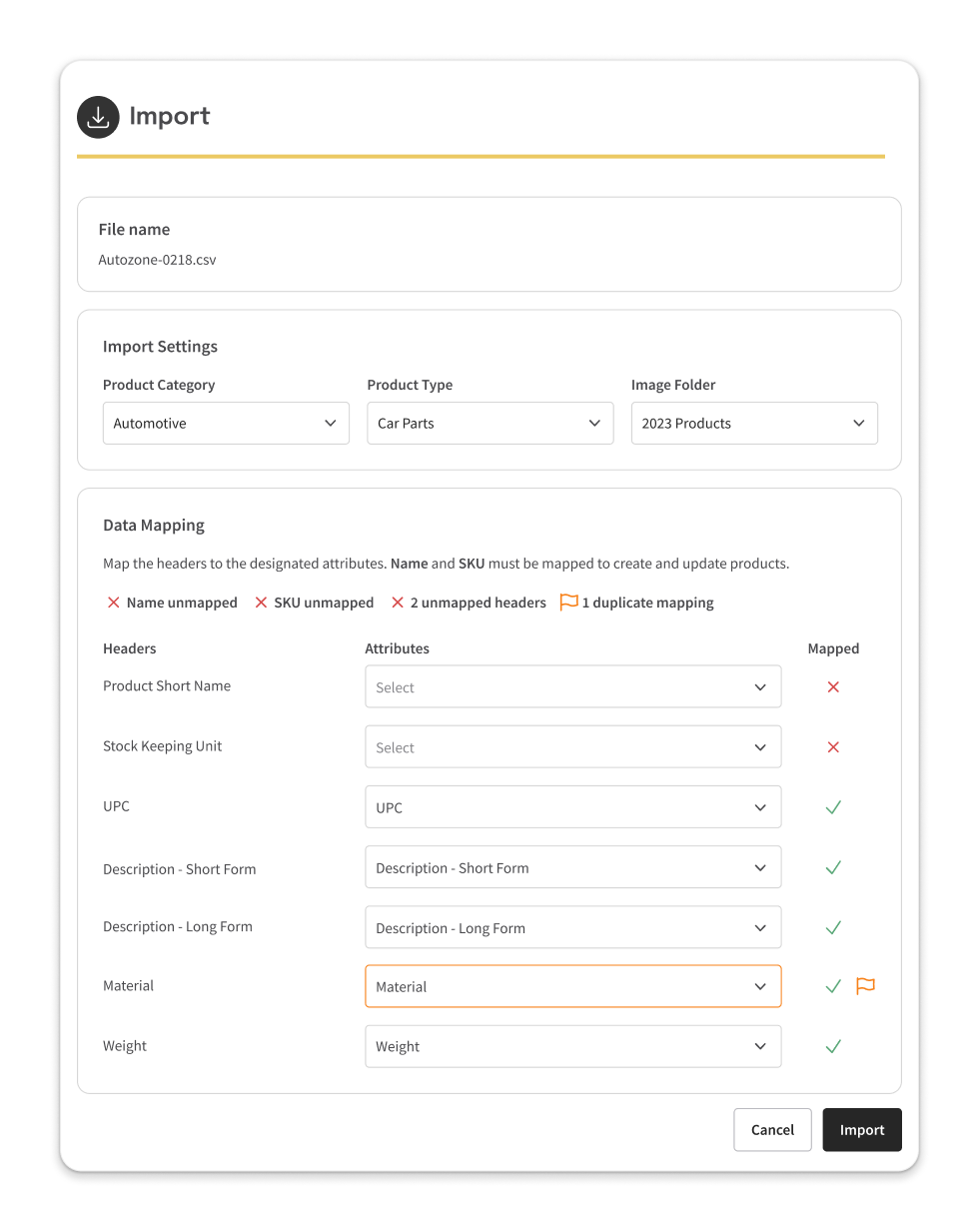
Streamlining Product Imports Through Intelligent Mapping and Visual Feedback
Customers struggled with convoluted import workflows. I redesigned the import experience to reduce friction and empower users through the following changes:
Enabled customers to add essential data such as product category, product type, and image assignments to folders.
Created automated data mapping with visual previews, making it easy to see how import fields matched PIM attributes.
Introduced visual semantic states that flagged missing or duplicate data in real time, so users instantly understood what was required and why.
The result was a significant boost in import confidence and speed, fewer failed imports, and a measurable drop in user support tickets for import issues.
Redesigning the Product Detail Page for Clarity & Control
The previous PIM product detail page left users struggling to view and edit product data. My redesign focused on reducing friction in data entry and management by:
Introducing a clean, modular layout that surfaced the most important product attributes for at-a-glance review and fast edits.
Embedding color-coded visual cues and icons to immediately flag missing or inconsistent data, so users could resolve issues proactively without searching through error logs.
Simplifying image management with an integrated gallery, supporting drag-and-drop uploads and clear assignment of images to specific product variations or channels.
Creating tabs to manage product variation and retail channel outlets, enabling users to review, add, or modify options quickly all in one view

By redesigning the user experience, building a scalable design system, and infusing brand expression, I helped create a more intuitive and engaging product—work that played a key role in the company’s acquisition.