Language Gives You
Opportunity
Client: LTI (Language Testing International)
Role: Lead Designer
Challenge:
Following Samsung's acquisition of Learning Technology Institute (LTI), a professional certification platform for tech workers, the company needed to grow its user base by 40% within 18 months. This required balancing Samsung's growth-focused approach with LTI's established reputation for rigorous professional testing, while managing competing stakeholder visions for the company's future direction.
As Lead Designer, I led a complete brand refresh and user experience redesign that repositioned LTI as a "Professional Growth Platform." Through regular stakeholder alignment sessions, I delivered a unified solution that maintained credibility while making certifications more accessible, resulting in faster user onboarding and significantly improved engagement rates across the platform.
We created a more contemporary brand
LTI had not refreshed its brand in over 20 years and needed a modern identity to carry it into the 21st century. Through close collaboration with the client, we identified four core values that became the foundation for the brand’s new look and feel.


Using iconography, candid photography, a primary color palette, a San Serif and serif combo - we created a brand that is both professional and academic while indexing on the aspirational with playful iconography and punchy headlines.
A Streamlined Site Structure
The existing LTI site AI was overly complex and repetitive. We streamlined the experience and designed flexible page templates to support a variety of content types.

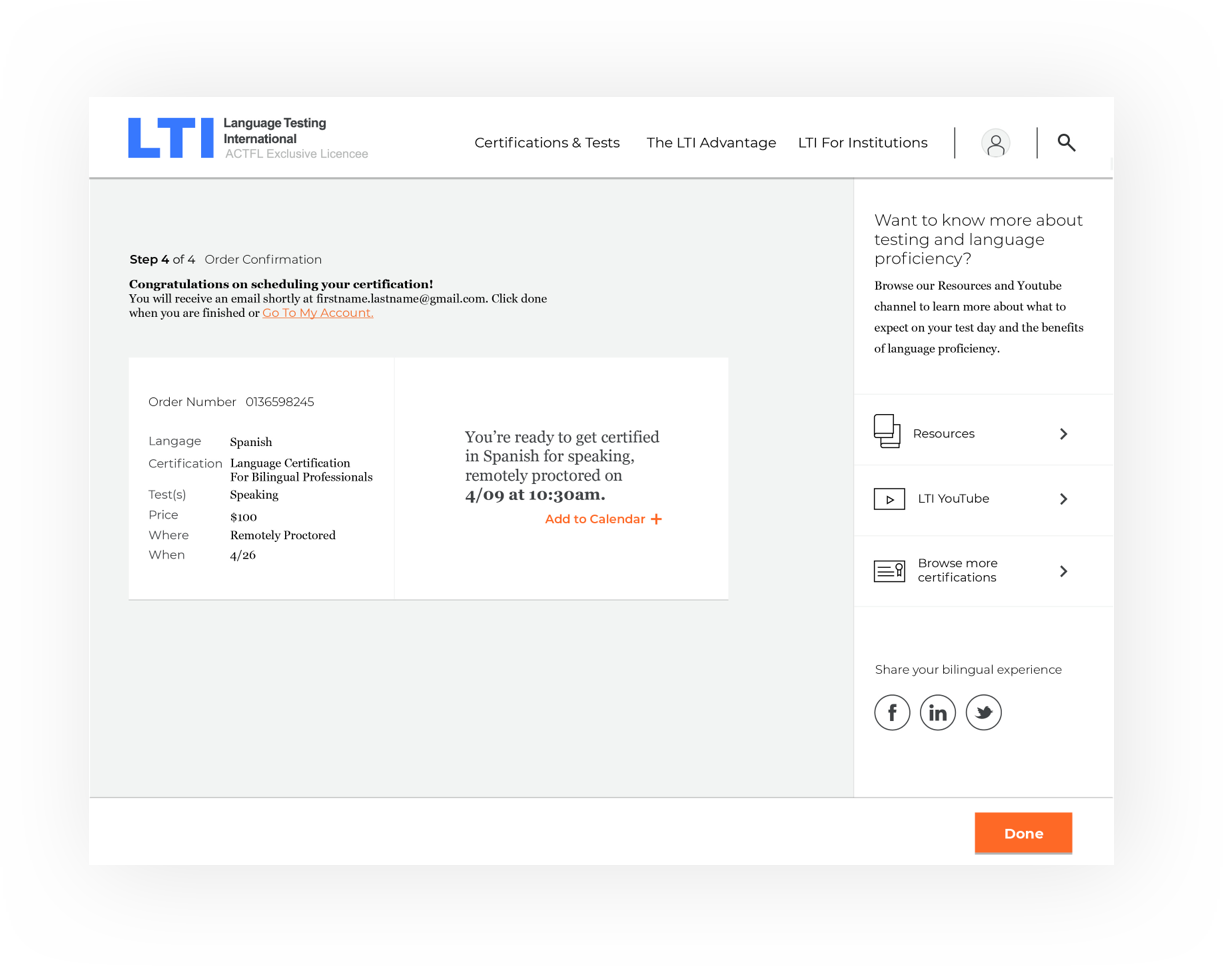
Interaction Made Simple
The existing LTI sign-up process for testing was cumbersome and frustrating. We transformed it into a simple, intuitive widget flow that guides users step by step, allowing them to add or remove modules, schedule their test date, and complete checkout effortlessly.