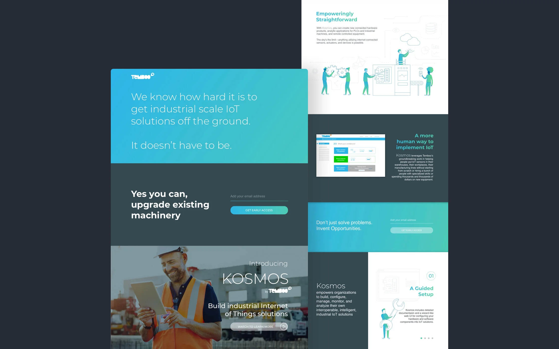
A Brand Is Born
Client: Temboo
Role: Lead UX/UI Designer
Project: During our three week engagement, I was tasked with creating a new brand language and design language for a new product called KOSMOS.
Challenge: I set out to create a brand in the Industrial IoT space that felt modern, distinctive, and true to the empowering nature of the product. Partnering closely with Temboo’s CEO, I sought to capture her vision and motivations while ensuring the brand conveyed warmth and humanity. Showcasing the human side of Kosmos was essential, with a focus on representing people in a way that reflects the diversity of the world as authentically as possible.

I designed a new brand to introduce KOSMOS to the world.
Kosmos needed to stand out in the Industrial IoT space while feeling human, modern, and empowering. I developed a high-contrast palette of slate gray, white, and a vibrant blue-to-green gradient, paired with Montserrat’s versatile typography to balance boldness and futurism. Photography grounds the product in reality by showing real people using Kosmos, while illustration highlights human interaction in a playful, approachable way. Together, these elements make the brand feel dynamic, accessible, and full of possibility.
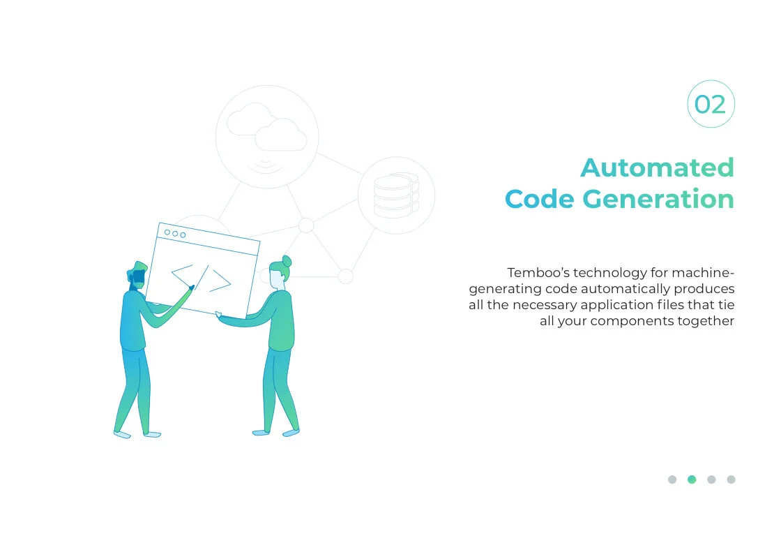
Illustration to tell the Kosmos story
Kosmos empowers organizations to build, configure, manage, monitor, and analyze their own intelligent, interoperable Industrial IoT solutions. To highlight the human touch behind this technology, I created illustrations that bring the people and processes at the heart of IoT to life.

Using the same illustration style I show the step by step process of how humans interact with various aspects of KOSMOS.